Color Psychology in Album Cover Design
Color is one of the most powerful tools in a designer's arsenal. It has the ability to evoke emotions, trigger memories, and influence behavior—all within milliseconds of viewing. In album cover design, especially in the bold world of brat aesthetics, understanding color psychology can mean the difference between a cover that resonates deeply with audiences and one that simply blends into the background.
The Science Behind Color Perception
Human color perception is both biological and psychological. When light hits our retinas, it triggers electrical signals that our brain interprets as color. But the fascinating part is how our brain associates these colors with emotions, memories, and meanings based on our personal experiences and cultural background.
How Colors Affect the Brain
Research in neuroscience has shown that colors can trigger specific responses in different areas of the brain:
The Limbic System: Colors directly impact our emotional center, triggering feelings before we even consciously process what we're seeing.
Memory Centers: Certain colors can trigger vivid memories and associations, making them powerful tools for creating connection.
Attention Networks: Bright, contrasting colors activate our attention systems, making them perfect for designs that need to stand out.
Primary Colors and Their Psychological Impact
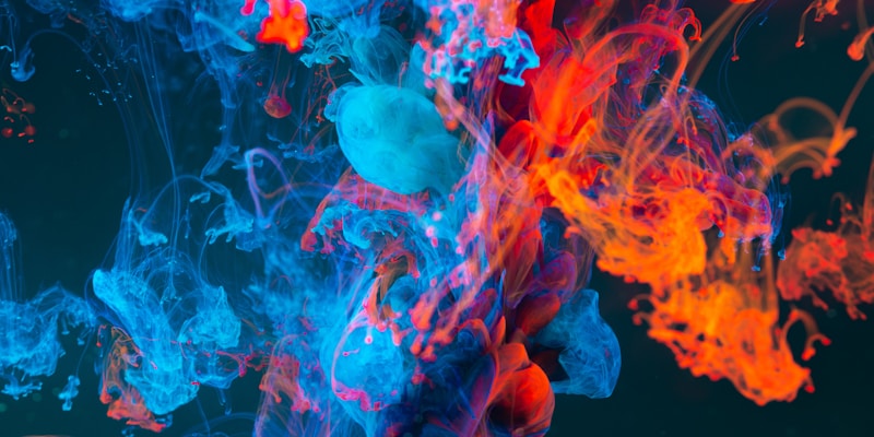
Red: Power, Passion, and Energy
Red is perhaps the most emotionally charged color in the spectrum. It's associated with:
- Passion and Love: Deep reds evoke romantic feelings
- Energy and Excitement: Bright reds create urgency and movement
- Power and Dominance: Red commands attention and respect
- Warning and Danger: Our primal association with blood and fire
In brat cover design, red works exceptionally well for:
- High-energy music genres
- Covers targeting younger demographics
- Designs meant to convey confidence and boldness
- Creating dramatic contrast with cooler colors
Blue: Trust, Calm, and Depth
Blue is universally associated with trust and stability, but its psychological impact varies greatly with shade:
- Light Blue: Tranquility, peace, and openness
- Navy Blue: Professionalism, authority, and reliability
- Electric Blue: Modernity, technology, and innovation
- Teal: Balance between blue's calm and green's growth
For brat aesthetics, electric and neon blues can provide:
- A cool contrast to warm accent colors
- Modern, digital-age appeal
- Trustworthy yet edgy brand positioning
Yellow: Optimism, Creativity, and Attention
Yellow is the color of sunshine and happiness, but it's also complex:
- Bright Yellow: Joy, optimism, and creativity
- Golden Yellow: Luxury, wisdom, and prosperity
- Neon Yellow: High energy and attention-grabbing
- Pale Yellow: Gentleness and subtlety
In brat design, yellow excels at:
- Creating focal points and drawing attention
- Conveying youthful energy and optimism
- Working as an accent color against darker backgrounds
- Building brand recognition through distinctiveness
Secondary Colors and Modern Interpretations
Green: Growth, Nature, and Innovation
Green has evolved significantly in modern design psychology:
- Lime Green: The signature brat color, representing freshness and rebellion
- Forest Green: Stability, nature, and authenticity
- Neon Green: Technology, innovation, and youth culture
- Mint Green: Calm, fresh, and modern
Lime green's dominance in brat aesthetics isn't accidental—it perfectly balances:
- Natural associations with growth and freshness
- High visibility and attention-grabbing properties
- Modern, digital-age appeal
- Rebellious departure from traditional color choices
Purple: Creativity, Luxury, and Mystery
Purple has long been associated with royalty and luxury, but modern interpretations include:
- Deep Purple: Luxury, sophistication, and mystery
- Bright Purple: Creativity, youth, and non-conformity
- Lavender: Femininity, grace, and calm
- Neon Purple: Futuristic, bold, and unconventional
For brat covers, purple offers:
- Sophisticated alternative to more common bright colors
- Excellent contrast with yellow and green
- Appeals to audiences seeking uniqueness
- Works well for artistic and creative positioning
Orange: Enthusiasm, Warmth, and Confidence
Orange combines red's energy with yellow's happiness:
- Bright Orange: Enthusiasm, warmth, and friendliness
- Red-Orange: Excitement, adventure, and boldness
- Peach: Softness, approachability, and warmth
- Neon Orange: High energy and visibility
Cultural Considerations in Color Choice
Color perception isn't universal—cultural background significantly influences how colors are interpreted:
Western Associations
- White: Purity, cleanliness, simplicity
- Black: Sophistication, power, mystery
- Red: Passion, danger, excitement
- Blue: Trust, stability, professionalism
Eastern Interpretations
- Red: Good luck, prosperity, celebration
- White: Mourning, spirituality (in some cultures)
- Yellow: Royalty, sacred, prosperity
- Green: Nature, harmony, growth
Modern Digital Culture
The internet age has created new color associations:
- Neon Colors: Digital native, youth culture, gaming
- Pastels: Aesthetic culture, social media, minimalism
- Gradients: Modern technology, apps, digital art
- High Contrast: Accessibility, clarity, bold statements
Color Combinations That Create Impact
Complementary Colors
Colors opposite on the color wheel create maximum contrast and visual impact:
- Red and Green: Christmas associations, but also high energy
- Blue and Orange: Trust meets enthusiasm
- Purple and Yellow: Luxury meets optimism
- Pink and Green: The classic brat combination
Analogous Colors
Colors next to each other on the wheel create harmony:
- Blue-Green-Purple: Cool, modern, sophisticated
- Red-Orange-Yellow: Warm, energetic, inviting
- Green-Yellow-Orange: Natural, fresh, optimistic
Triadic Colors
Three colors equally spaced on the wheel offer vibrant balance:
- Red-Blue-Yellow: Primary energy
- Orange-Green-Purple: Bold and dynamic
- Pink-Lime-Blue: Modern brat aesthetic
Emotional Triggers in Color Selection
High Energy Combinations
For covers targeting energetic, youthful audiences:
- Neon Green + Hot Pink: Electric energy
- Electric Blue + Bright Yellow: Tech-savvy optimism
- Orange + Purple: Creative confidence
- Red + Yellow: Pure excitement
Sophisticated Palettes
For more mature or luxury positioning:
- Deep Purple + Gold: Luxury and exclusivity
- Navy + Coral: Professional yet approachable
- Forest Green + Cream: Natural sophistication
- Charcoal + Bright Accent: Modern minimalism
Emotional Resonance
For covers aimed at creating deep emotional connection:
- Warm Reds + Soft Pinks: Love and passion
- Cool Blues + Purples: Introspection and depth
- Earth Tones + Bright Accent: Grounded yet optimistic
- Monochromatic + Single Pop: Focused intensity
Technical Applications
Digital Color Considerations
When designing for digital platforms:
- RGB vs CMYK: Digital requires RGB color space
- Screen Variations: Colors appear differently across devices
- Accessibility: Ensure sufficient contrast for readability
- File Compression: Some colors compress better than others
Platform-Specific Adaptations
Different platforms may require color adjustments:
- Instagram: Vibrant colors perform well in feeds
- Spotify: Consider how colors appear in small thumbnail sizes
- Apple Music: Darker backgrounds may enhance color pop
- YouTube: Bright colors help with thumbnail visibility
Color Harmony Tools
Utilize digital tools for perfect color selection:
- Adobe Color: Professional color wheel and harmony rules
- Coolors: Quick palette generation and inspiration
- Color Hunt: Trending palette collections
- Paletton: Advanced color scheme generator
Psychological Triggers for Different Genres
Electronic/Dance Music
- Neon colors: Digital age, club culture
- High contrast: Energy and excitement
- Gradients: Futuristic, technological
- Bright backgrounds: Visibility in crowded feeds
Pop Music
- Bright, cheerful colors: Mass appeal
- Trending palettes: Current aesthetic relevance
- High saturation: Energy and youth
- Memorable combinations: Brand recognition
Alternative/Indie
- Unique color stories: Artistic expression
- Unexpected combinations: Non-conformity
- Muted brights: Sophisticated rebellion
- Artistic palettes: Creative authenticity
Testing and Optimization
A/B Testing Color Choices
Test different color versions to optimize performance:
- Engagement rates: Which colors drive more interaction
- Click-through rates: Performance in digital campaigns
- Retention: How memorable different color choices are
- Demographic response: How different audiences respond
Feedback Collection
Gather insights on color effectiveness:
- Focus groups: Detailed qualitative feedback
- Social media responses: Real-time audience reaction
- Analytics: Data-driven color performance
- Professional critique: Design community feedback
Future Trends in Color Psychology
Emerging Associations
New color meanings developing in digital culture:
- Holographic effects: Futuristic, premium, unique
- Sustainable greens: Environmental consciousness
- Tech-inspired palettes: AI, VR, digital innovation
- Inclusive colors: Broader representation and accessibility
Technology Integration
How technology is changing color use:
- Dynamic colors: Apps that change based on time/mood
- Personalized palettes: AI-driven color recommendations
- Accessible design: Better tools for inclusive color choices
- AR/VR considerations: Color in three-dimensional spaces
Practical Application Strategies
Start With Emotion
Begin your color selection process by identifying the emotional response you want to create:
1. Define the primary emotion or feeling
2. Identify supporting emotional layers
3. Consider your target audience's cultural context
4. Select colors that align with these emotional goals
Build Systematically
Create a methodical approach to color selection:
1. Primary color: Your main brand/emotional driver
2. Secondary colors: Supporting colors for balance
3. Accent colors: Small pops for interest and contrast
4. Neutral colors: Background and text colors
Test and Refine
Never finalize colors without testing:
1. Create multiple variations
2. Test across different devices and platforms
3. Gather feedback from target audience
4. Refine based on performance data
Conclusion
Color psychology in album cover design is both an art and a science. While understanding the psychological impacts of different colors provides a strong foundation, the key is applying this knowledge thoughtfully and creatively to serve your specific artistic vision and audience needs.
The most successful brat covers don't just use bright colors—they use colors that tell a story, evoke specific emotions, and create memorable visual experiences. By combining psychological principles with creative intuition and systematic testing, you can create covers that not only look stunning but also perform exceptionally well in capturing attention and building emotional connections.
Remember that color trends evolve, cultural associations shift, and new technologies create new possibilities. Stay curious, keep experimenting, and always consider your audience when making color choices. The perfect color palette for your brat cover is one that authentically represents your artistic vision while resonating powerfully with the people you want to reach.